Ping
July 2024
Made with Michelle
For Kenney Jam 2024
In Godot

Goals
The main goal of this project was to create an original game in the game jam's 48 hours time constraint. This would help us grow our general game development skills as well as specifically improve understanding and comfort with the Godot game engine.
Participating in the jam brought its own constraints: we had to use only existing assets made by Kenney, and we had to fit the jam's theme of "Connection".
Participating in the jam brought its own constraints: we had to use only existing assets made by Kenney, and we had to fit the jam's theme of "Connection".
Pivot to Godot
I initially wanted to write the game in Javascript, using WebGL to drive the graphics. I really like the idea of doing something completely custom, and using JS would let us trivially embed it anywhere on the web.
I figured if we had a tilemap object and an animated sprite object, we could make a functional and polished game. (Those two things would probably be enough to implement Ping, for example.) I was not able to make these functional in time ahead of the jam.
Right before the start of the jam, we decided to play it safe and pivot to Godot. I had some experience with Godot, but Michelle had none, so the decision was not without some risk. Michelle's lack of experience with other game engines, however, would probably have made working from scratch in JS harder than Godot anyway.
Pre-Production
When the "Connection" theme was revealed, we began brainstorming related ideas. Ideas of human connections, internet connections, and graph data structures came to mind. We reduced down to a few game ideas, including one about sharks biting undersea cables.
We started on an idea of trying to connect two physically seperated people by routing their messages. We took inspiration from networking structures and this abstract message formed as an network packet, where we would make the player route them to the proper destination in order.
We weren't sure how these packets were to get from the conveyor belt to the destination. Is this a game about reacting to what's coming quickly and drawing straight line paths? Or is this a game about rotating tiles to make a path, like Webkinz' "Home Before Dark"? Or do you have some stock of limited or infinite tiles that you drag onto the grid to form paths?
Along the lines of the last idea, we ended up on an infinite supply of arrows that change a packet's velocity. We also decided that every packet would move at once on a tick, which we could speed up or slow down to tweak the difficulty.
Before the jam, I felt inclined to make an arcade type game about chasing high scores, because it seemed more in scope than trying to design multiple levels. The design we settled on fit well into this structure.
Scoring, Tetris
I took inspiration from Tetris for the levelling/scoring system. In Tetris, clearing some number of lines advances the level, but your score is based on how many lines you can clear at once. This keeps the game's pace accelerating (even if you aren't scoring Tetrises) and rewards optimal play by letting you get more points off before the speed catches up to you.
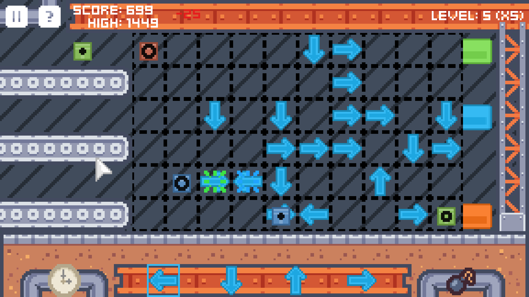
I also introduced combo scoring not unlike modern Tetris rules. In addition to not losing points for dropping packets, combos give additional points for perfect play, raising the skill ceiling. Since each level increases a multiplier on your score, scoring one additional point per successive packet can add up very quickly.
One elegant aspect of Tetris's design that I also tried to emulate was the use of space. In Tetris, your entire board is always visible, and you can clearly see when things have gotten too messy or high up and you need to burn down. Our game is less immediately readable than Tetris, since the packets all have velocity you have to track. It does have a similar sense of managing space to Tetris, as a chaotic board covered in arrows makes it much harder to envision the path of a packet.
One alternative design that I would have liked to try is if the packets never explode, and just pile up on your board, with more and more destinations queueing up. We can extrapolate the loss state being when no more packets can spawn. This would be much more like Tetris, and maybe better for it, although the depth from combo scoring would be lost. Experimenting with and testing design variations like this was unfortunately out of scope for our very limited time.

Development
Using Godot was a bit of a learning curve, but I had some experience with tilemaps in it, and a good amount of experience in other engines that helped me design the architecture of the game.
As is the nature of code thrown together in a caffeinated frenzy, the code is extremely hacky and spaghetti. Nodes reference other nodes in bizarre, inconsistent ways that can break everything if you move or rename them. We had to sacrifice clean code for the sake of finishing the game in time. I'm sure this happens often in game development. (jams particularly)
One thing I was very particular about was making everything fit the resolution. The initial spritesheet with the treadmills we decided to work with had strange 18x18 tiles (rather than a more standard 16x16). We ran with an initial resolution of 16 of these tiles by 9, or 288px by 162px. We were very particular about the mouse and scrolling background being quantized to the pixel grid, and trying not to interpolate blurry subpixel positions.
Player Guidance
For a simple game like this, I wanted it to have the toy-like qualities of Tetris or Solitaire, where one can determine the game's mechanics through experimentation, and seeing what actions the game permits.
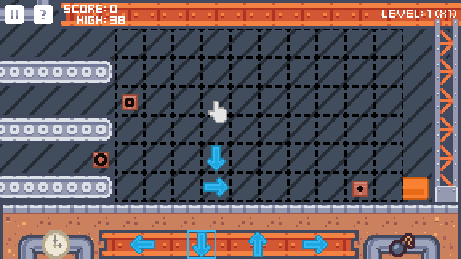
Level 1 is designed to let you play around and figure out the packet mechanics and failure conditions. There is only one destination, and the packets come slowly and in order. This should allow an experimenting player to understand packet collisions and packet order, but it is not perfect.
I think the order of the packets with the increasing circle size reads very poorly. For some reason I didn't want to just number them (I think there was not a good asset that fit the size of the packet sprite). If one doesn't read the help, and drops their first packet, they may be deeply confused when the destination rejects the 2nd or 3rd packet, and quit the game there in confusion and frustration. I still wonder if there is a way to convey order clearly without numbers, but clearly numbers would have been a better option for this game. (Maybe use regular polygons with increasing sides? i.e. triangle, square, star) (Maybe the destination should show what packet it's currently expecting?)
Another problem with the first level is that it can take a while for the packets to show up. I should have made the first packet always appear at the start, but instead it's based on a random chance. The confusion over the tick sound and button is at least (hopefully) alleviated by the time the packets show up.
The help menu that Michelle made is essential to teaching about the keyboard shortcuts and mechanics, but I wonder if we could have made a stronger game system that requires no such textual explanation. One of the optional challenges for the jam was to make a game with no text in it, which we considered pursuing. I did try to imagine how we could represent our game concepts without any text, which is where the circles for packet order came from.
Polish
Once we had the core game I wanted to make sure it looked like a finished, if small product.
I found some free sound effects online, from Kenney and elsewhere. I asked my friend SplitSuns if we could use his song "Jettison", which I felt fit the arcadey energy of the game. These sounds helped the game come together at the end, but I wish I had implemented some sliders for them.
Michelle spent a lot of time making the UI for the title screen, pause, and especially help menus. I think the title screen, simple as it is, does a lot to give the game some more ceremony on bootup, and allow us to fit some credits on there. The help menu is essential, as the game is otherwise not super well explained.
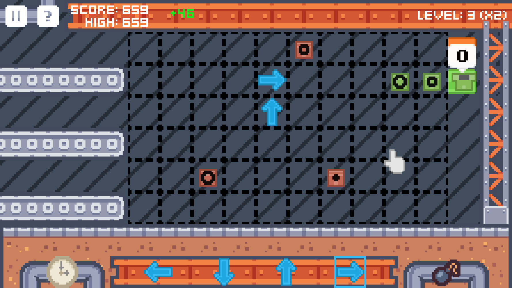
I had fun making the packets ease with every move and animate open at the end. The easing movement actually helps the screen read much more clearly than when they simply jumped to their next position. This introduced some problems with packets crossing the screen when they exploded and returned to the start, but I was able to fix that. Godot has great tools for tweening like this, and it was easy to implement once I understood them.
The letters that pop out of the packets as they arrive are my favorite detail of the game. They help contextualize the abstract packets as pieces of internet communication (rather than this being a game about routing boxes in a warehouse!). Plus, I was able to slip some fun little messages in them :)

Cut Features
Cut feature: viruses. We wanted to have viruses or corrupted packets that can infect other packets. Along with this, there would be a permanent recycling bin destination to route the bad packets to to destroy them. We actually did implement this recycling bin, but scrapped it when we decided there was no time for viruses. The viruses would have also necessitated destinations being able to give up on receiving packets and leave. We decided our core system had enough push-and-pull without this additional complexity.
Cut feature: locked tiles. We wanted later levels to introduce random arrows or walls locked in place, forcing you to (most likely) route around them. I still think this is a good way to increase complexity (and therefore difficulty) in later levels, but we did not have time to implement or test such a thing.
Cut feature: variable length messages. Simple enough, some messages might require more or less than the standardized 3. I think making them 2-4 messages long would have been fine, but it would maybe be less clear and make the already hard to read packet order worse.
Cut feature: balance. We barely had enough time to finish the game, so we had little to no time for playtesting and tweaking values. I think the complexity ramps up to 3 simultaneous destinations a little too fast, I probably would have changed that with more time. As mentioned previously, I also would have liked to explore other design spaces adjacent to where we ended up, such as removing packet collisions and letting them stack up and block sections of the board.
Final Thoughts
I think we made a fun game with a clever core system. Being able to manually tick the game lets you set the pace, and I think high level play is possible and fun if you can master the keyboard shortcuts. It reminds me of little flash games. I am proud of this game.
I also think there is a lot to improve on. Visually, the game lacks cohesion or interest. It's cute, but very generic looking and abstract. I don't mind abstract, but this game would have benefitted from leaning into the network angle more. (In this sense, we were limited by the assets available to us.) The sound effects are also pretty generic. A more polished game would have a more cohesive sound. The main game system, as simple as it is, still requires textual explanation. I wanted something intuitive and immediately understandable, and I think I could have conveyed the mechanics more clearly.
I did not get a chance to nerd out with some custom web-based engine like I wanted to, and I think that would have been a valuable experience. I am considering that for future games.
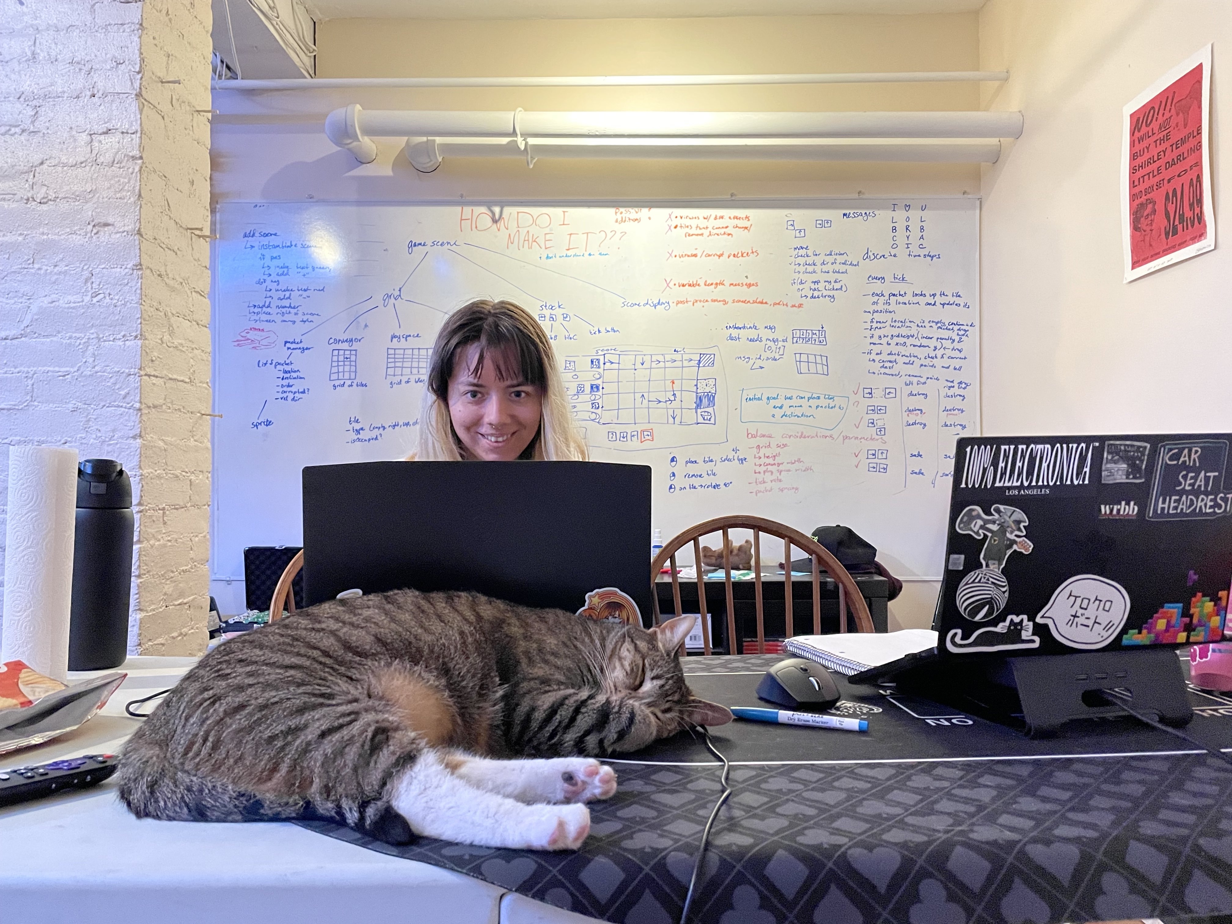
I had a great time making this game with Michelle! Here's to 11 more!

